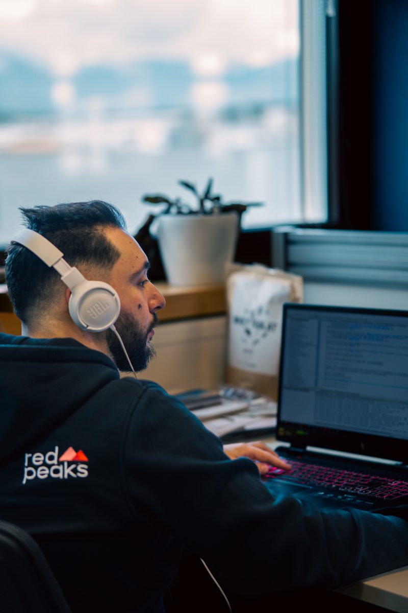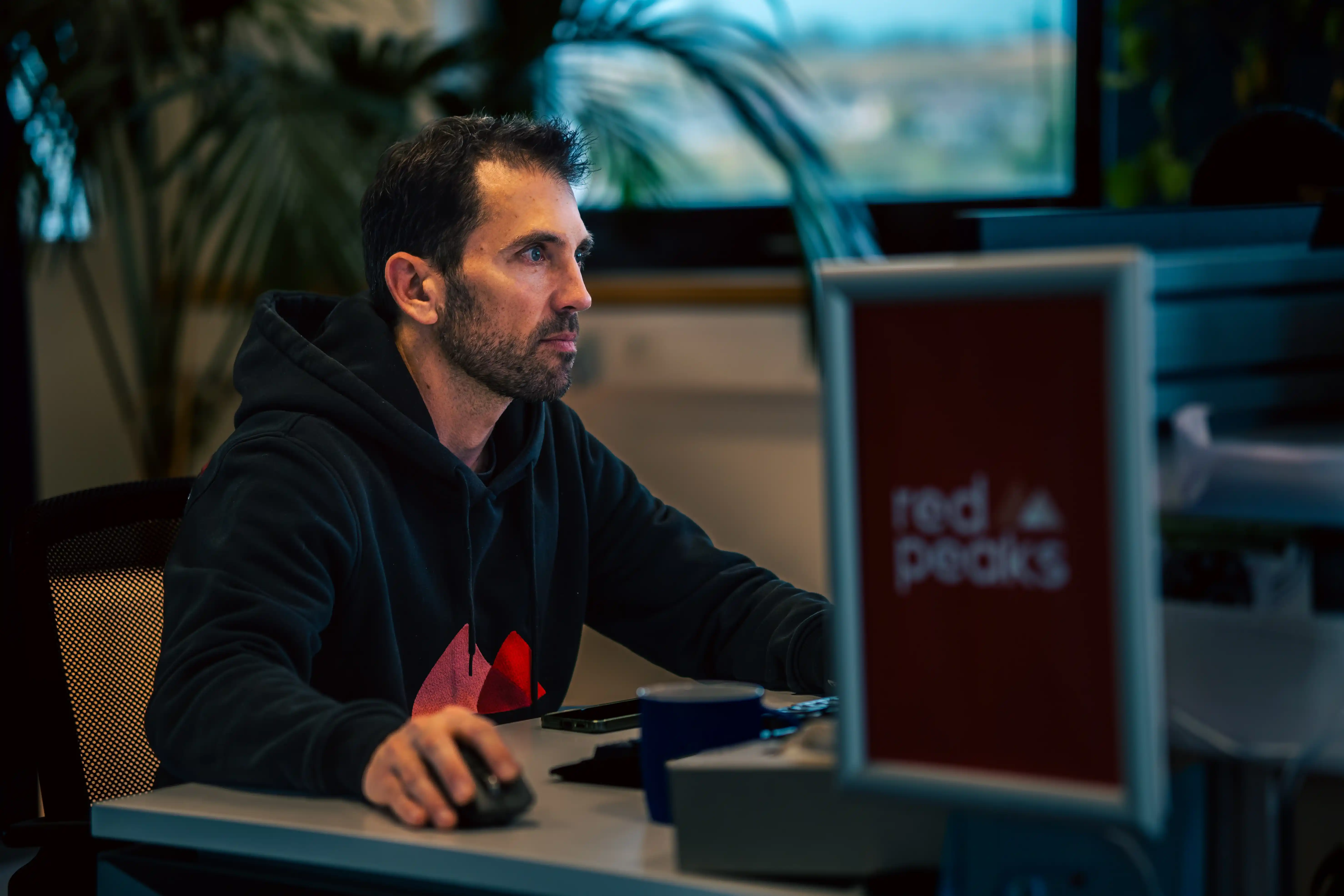
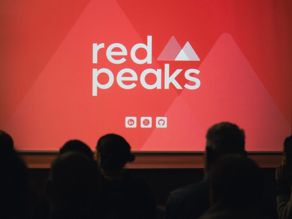

Redpeaks
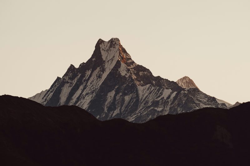
The Swiss mountains hide much more than just peaks. Nestled between their walls are offices where experts monitor the health of critical SAP systems around the world.
Redpeaks Monitoring detects the invisible and alerts before disaster strikes. After nine years, this expertise deserved an identity that resonates as strongly as their technology.
What we created: A 360° rebranding inspired by mountaineering, from naming to digital communication, with an ongoing partnership since January 2023.
- The brief
- Our solutions
- Results
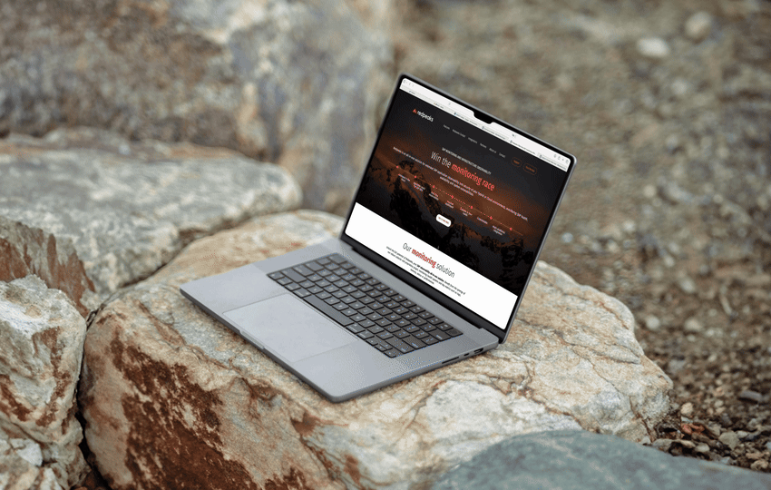
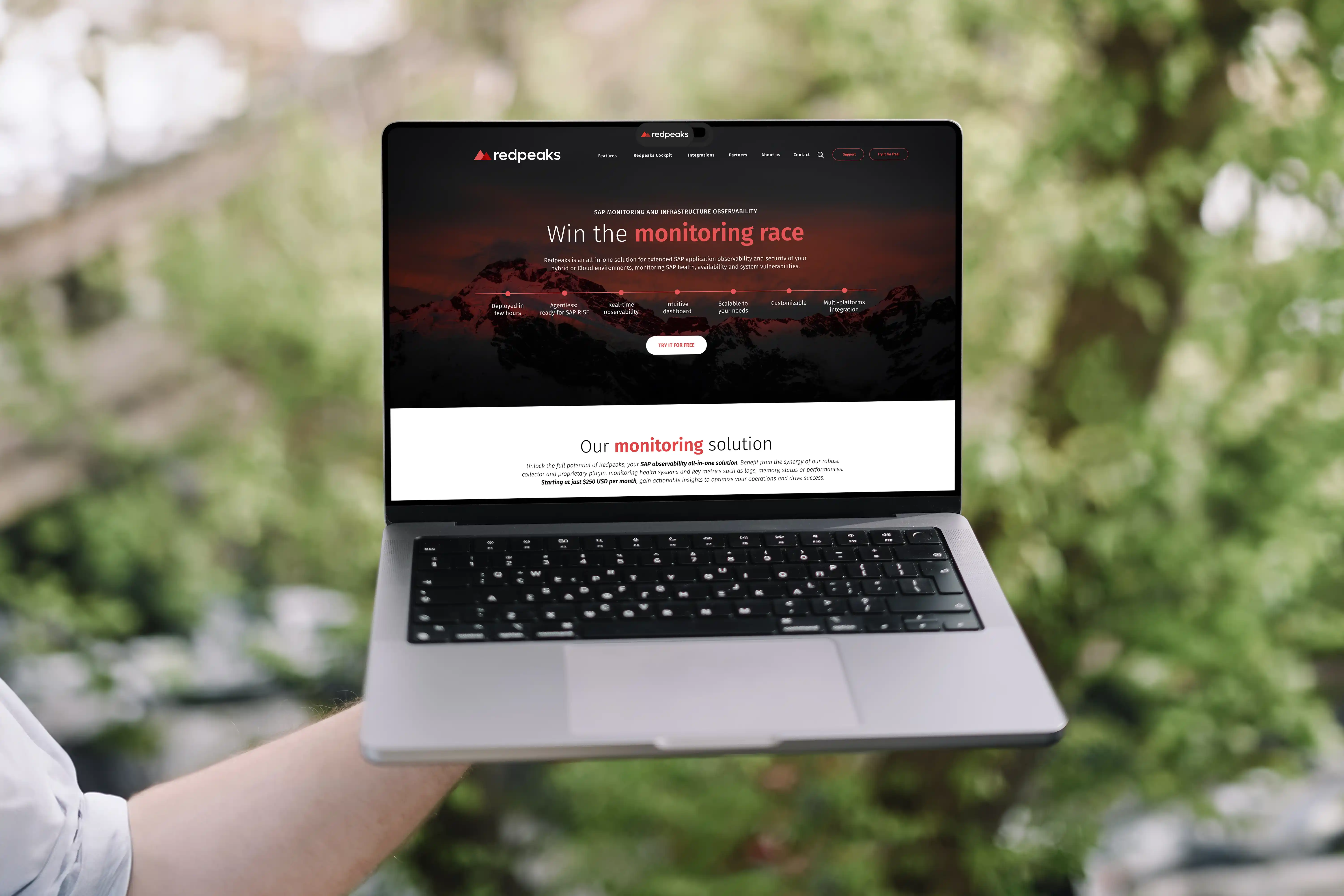
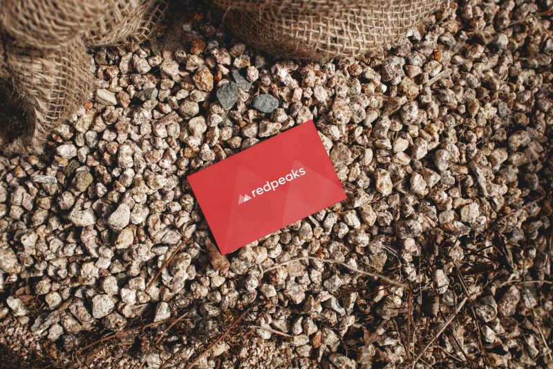
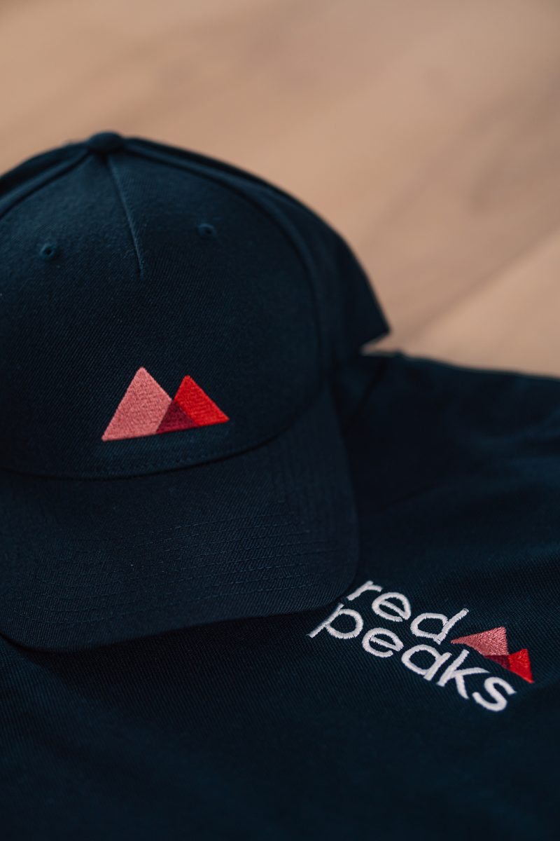
Redpeaks wanted to completely reinvent itself to consolidate its position as a leader in the SAP monitoring market. The challenge was to create a strong and memorable identity in an often austere technical sector, make their complex solutions accessible, and establish consistency as a guiding principle across all media. The ambition was clear: to become the number one solution on the market.
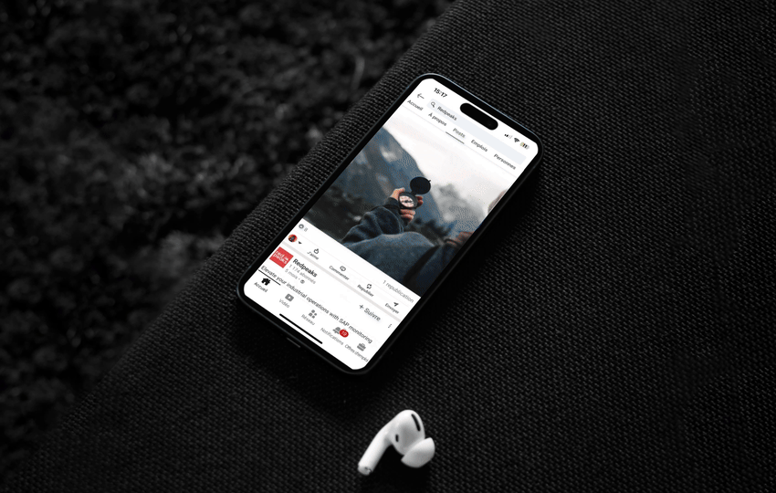
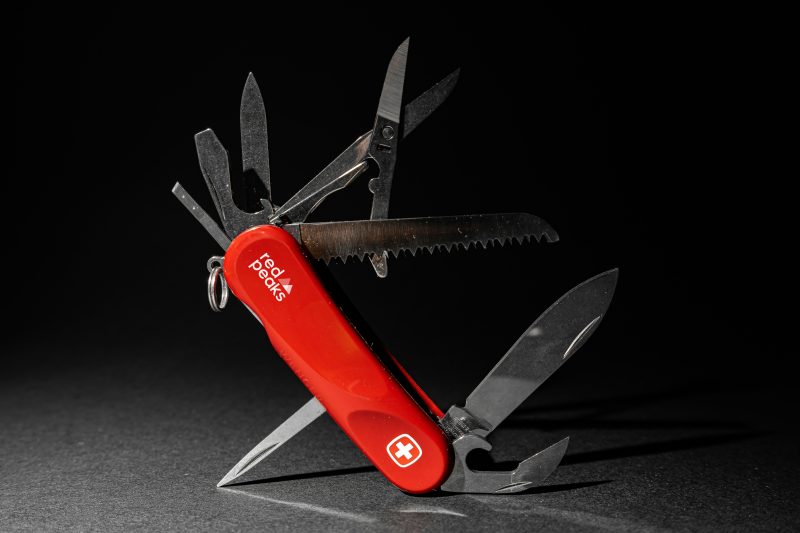
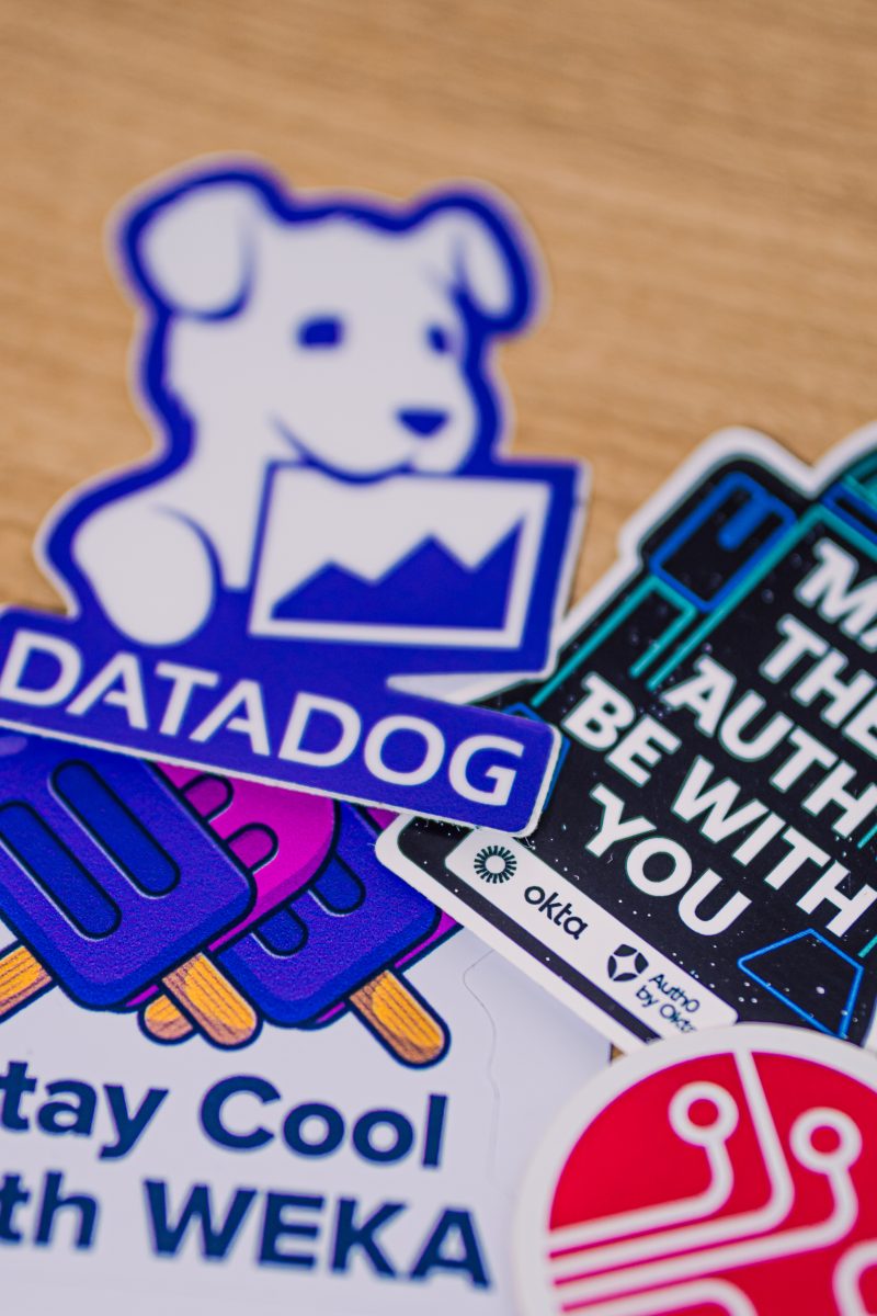
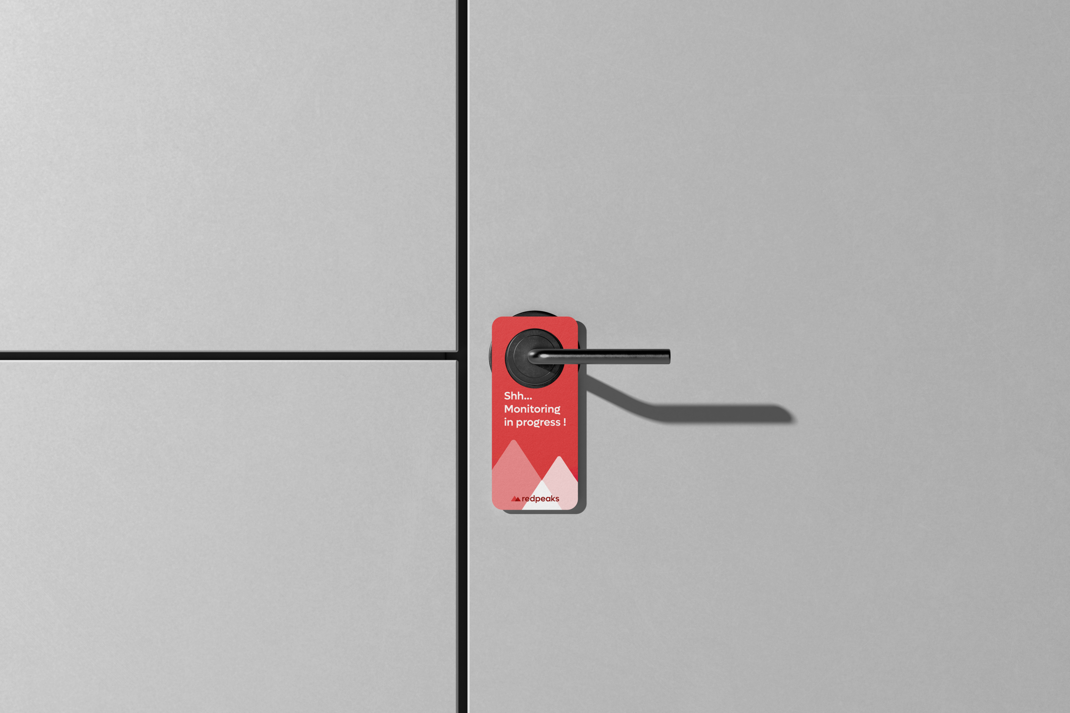
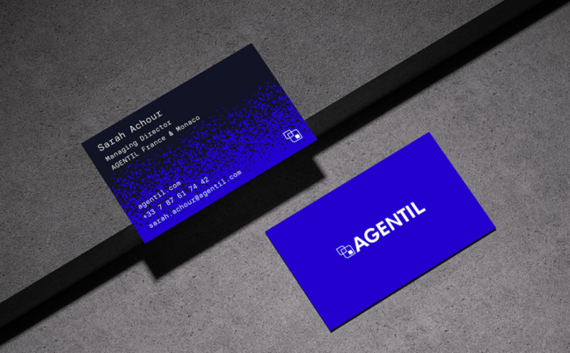
Design inspired by the peaks surrounding their offices, storytelling of alpine adventures, visual vocabulary evoking performance and altitude. We rebuilt their entire brand universe with this consistency as the common thread: rethought naming, complete graphic charter, redesigned website, SEO strategy, digital communication, and creation of all internal and external media.
Redpeaks finally has the identity it deserves. Recognizable, consistent, and memorable, the brand stands out in its sector and asserts its leadership. Since January 2023, our collaboration has continued to fuel this transformation and strengthen their position as a benchmark in SAP monitoring.